
BRATTLEBORO — Emily Mason, the noted New York abstract painter and longtime half-year resident of West Brattleboro, is presenting a show of monoprints and monotypes at Mitchell-Giddings Fine Arts on Main Street, up until Jan. 7.
The works, 40 of them, are basically paintings painted on a separate plate and then transferred to paper by running it through an etching press. There are often many layers, and the techniques have many elaborations. The gallery staff does quite a good job explaining how they are done. This print work has become an important sideline to her painting career.
I would suppose that it is also a seedbed for fresh ideas. There is an unusual degree of variation in mood and attack in the show, which does span 32 years. She has aptly titled the show “Explorations.”
Mason's language is color, form, texture, the quality of edges as shapes touch, placement in the framed space, the level of crowdedness or openness - these are as music to her. She is a lyrical abstractionist (as opposed to a geometrical abstractionist, for example) and, most important, she scorns preconception.
The image that eventually emerges will be the product of an evolution as she responds to one stroke with another, as it requires. It is this on-edge alertness, this flying without a net, that gives such vitality to her work.
* * *
By this stage in her life, Mason is thoroughly marinated in color. Her fluency can astound, both in deft nuance and in an almost-spiritual grasp of a color's intrinsic power.
Willem de Kooning is said to have remarked that he wanted his color to look as good as it does in the can. He refers to color not as a component of a general colorfulness but as a thing in itself. Mason carries this concept further.
One of her prints - “Magic,” 2000 - presents, to me, the mother of all blues. Blue-ness is the very subject of the work. Of course, she coaxes it into being so by artifice, enhancing the hue by a subtle framing tone ... and perhaps by magic.
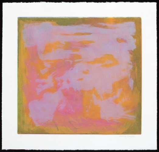
A piece I am particularly fond of - “Settled,” 2004 - illustrates one way Mason gets an internal dialogue going. One sees first a glowing yellow/orange square bordered by a darker golden green. The square is divided into halves by a rose rectangle that leaves a faint vertical right down the middle. Playing the edges, now fuzzy, now sharp, she places the square atop the green with a firm overlap in the upper left corner.
This spatial relationship wants to push the square right out into the room if not for the bold-but-delicate restraining stroke of pale gray she has overprinted. This quiet push-pull contest will go on forever ... it's a relationship! This is painterly virtuosity, and it delights.
* * *
I have been acquainted with Emily Mason for many years. Indeed, I believe the first artwork I bought in my life is her small oil on paper, which I got in the late '60s and which I look at every day. I confess to being a fan.
Viewing this show, letting myself be pulled in to each experience, memories return of Mason, in her kitchen, offering me a special berry or some exotic (Italian?) vegetable just picked from her garden.
I look at that crackly texture that is so perfect in the large print on the gallery stairway (“Thoughtful,” 1987), or the subtle dimming veil that forces the yellow to push through, thereby making it stronger (“Altered States,” 1992) and think of her zestful appreciation of small qualities, not separate from the strong emotional drive of the work, but essential to it.